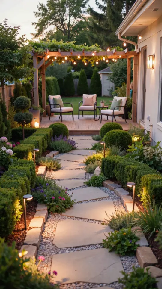
When I first started planning my patio makeover, I knew I wanted something that felt both dramatic and timeless. After a few failed attempts with boring beige, I finally landed on a deep jewel tone palette with gold accents, and honestly, it changed how I use my entire backyard. The trick was finding the right patiopaintcolors that could tie into my home’s interior, creating a whole house harmony that flows from the living room right out to the patio furniture. This is the story of what actually worked, what I messed up, and how you can pull off the same look without second guessing yourself.
Why Deep Jewel Tones Work for Outdoor Walls
I painted my patio wall in a rich sapphire blue called “Black Iris” by Behr Marquee, and at first I was terrified it would feel like a black hole. But deep jewel tones actually reflect light in a surprising way, especially when the sun hits them late in the afternoon. They create a cozy, intimate backdrop that makes the space feel like an extension of your living room rather than just a concrete slab. For a smaller patio, a dark wall on one side adds depth and makes the area look larger, not smaller, because it blurs the edges.
My neighbor tried a similar deep emerald green on her fence panels, and she told me it makes her plants pop like crazy. The key is to use a matte or satin finish for the walls to avoid glare, and to pick a paint with UV protection so it doesn’t fade after one summer. I learned that lesson the hard way with a cheap can of glossy navy that turned purple by August.
Balancing Dark Paint with Soft Neutrals for High End Appeal
Once you commit to a bold wall, you need something to balance it out or the whole yard starts feeling like a cave. I paired my deep blue wall with a soft, warm white on the trim and ceiling of my covered patio. That mix of dramatic dark and airy neutral is what gives the space that high end, resort feel. For furniture, I stuck with natural linen tones and a beige outdoor rug that has just a hint of taupe in it. The contrast makes the jewel tone the star without overwhelming the eye.
Here is the exact neutral palette that worked for me:
- Wall color: Behr Marquee “Black Iris” (deep blue with violet undertones)
- Trim and ceiling: Sherwin Williams “Alabaster” (warm white, not stark)
- Furniture cushion base: “Linen” by Sunbrella in a sand color
- Rug: A low pile beige with a subtle charcoal grid pattern
You can swap the wall for a deep charcoal or even a dark burgundy like “Oxblood” by Farrow and Ball, but keep the neutrals light and earthy. Do not go pure white on the furniture, it gets dirty fast and looks too cold against the deep tones.
Gold Accents That Actually Last Outside
Gold accents were the game changer for my whole house paint scheme. I added them through metal planters, a small side table, and the hardware on my storage bench. But I quickly learned that not all gold finishes hold up in the weather. I bought a cheap gold spray paint for a planter, and the top coat peeled off within two months. What did work were powder coated aluminum pieces and solid brass that develops a nice patina over time, but only if you seal it with a clear outdoor lacquer.
For a low maintenance option, look for “gold leaf” or “antique gold” finishes on outdoor furniture brands like Polywood or Tropitone. I also found that mixing gold with a little matte black hardware keeps the look from feeling too blingy. Hang a couple of gold tone pendant lights from the ceiling, and the light bounces off the dark wall in the most flattering way during evening dinners. My friends always comment that it feels like a fancy restaurant back there.
Matching Patio Furniture Colors to Your House Exterior
I cannot stress this enough: your patio furniture colors should not fight with the siding or brick of your actual house. My home has a warm gray stone veneer, so my dark blue wall and neutral furniture tie in perfectly. If your house is red brick, avoid cool blues on the patio because they clash. Instead try a deep olive green or a dark terracotta that picks up
#patiopaintcolors #outdoorliving #colorpalette #wholehousepaint #backyardmakeover
Leave a Comment